Moregenta
On the whole, I appreciate CMYK’s Magenta series, which takes classic card games and shrouds them in oversized pink boxes. Don’t believe me? Uh, that’s an odd thing to not believe. Here are the receipts: Fives, Duos, Figment, and Fruit Fight. Now you can get back to the serious business of not believing the propaganda in your social media feed.
Anyway, two new titles have now been added to Magenta. They’re both excellent. I’d even say that these are the best games in the series to date.
No Thanks!
Yeah, yeah, it feels a little silly to introduce No Thanks!, Thorsten Gimmler’s 2004 classic that has spawned imitators and admirers across the hobby. Don’t believe me? Look, we really need to work on your trust issues, but John D. Clair’s Empire’s End is a good recent example.
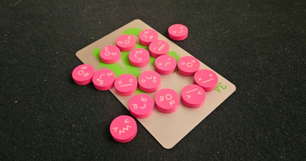
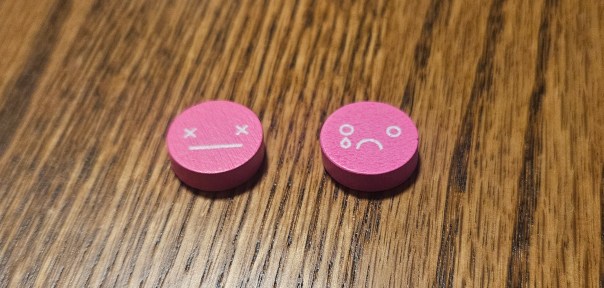
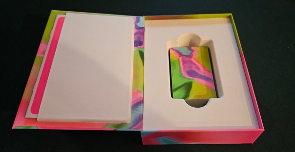
For the uninitiated, No Thanks! presents one big negative draft. Like all of the Magentas, the production is light on components. There’s a deck of thirty-three cards that range in value from 3 to 35, a bunch of tokens that some kid is 100% going to mistake for candy, and a box that could fit like twelve copies of itself within its expanse.
The gist is that cards are worth points equal to their printed value. Tokens are worth negative points. Oh, and points are bad, in case you were wondering. Low score wins. Which means it’s incumbent on you to avoid taking high cards, or really any cards at all. Whenever a card is flipped, everybody goes around the table and either bids a token or takes the card. In the latter case, that also means nabbing all the tokens that have already been bid.
Bidded? Bade? Badded? Bidet? Hm.
Like that chasm of a box, No Thanks! contains a few untold fathoms of its own. For one thing, sometimes a card won’t be such a bad thing to take. Sure, maybe its value is low. Claiming a 5 isn’t a big deal, right? But Gimmler does one better. Sometimes you want cards. Because if you can cobble together a run, say a 14, 15, and 16, then you only earn points equal to the lowest value in that spree. Even better when you can link far-flung numbers together. Holding a 22, 23, 25, and 26? If that 24 shows up, you might just erase half your score. Even more if you can also pick up some tokens.
The trouble is that if is doing some heavy lifting. When the game starts, nine cards are removed from the deck. You don’t know the odds that any given number will appear. All you can do is push your luck, both with the draw and with your fellow players.
Naturally, that latter part is where No Thanks! truly shines. This is a social game first and foremost, one that demands you watch your fellow players keenly. More than once, I’ve seen a session tanked because someone — most recently my best bud Brock — got distracted and passed on a card that really shouldn’t have been passed down the line. It isn’t enough to scope out the cards you want most. You also need to watch for the stuff that will evaporate a rival’s score entirely.
And then, ideally, argue about why someone else should claim it instead of you.
It’s a perfect fit for Magenta. No Thanks is small, easy to learn, takes one minute to explain but many minutes thereafter to master, and looks good in pink, silver, and green. In some ways it feels quaint, at least to this jaded player. But that’s also, I suspect, largely the point of this series. Magenta isn’t about big experiences. It’s about little revelations. No Thanks! fits the bill.
Which makes it all the more surprising that I actually prefer its opposite title…
I’m Out
“Like UNO?” my friend asked. Because, you see, the objective of I’m Out is to shed your entire hand of cards.
“Sure,” I replied. “Like UNO.” And all the while, I thought to myself, Like UNO. If UNO were crazy good.
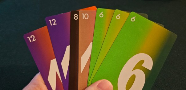
Designed by Masato Uesugi, and originally published as 13 Leaves, I’m Out presents itself as even simpler than No Thanks! The production is simpler. There are no tokens here, only a deck of sixty-two cards. The deck composition is simpler. The cards are ranked, 1 to 13, but clustered, with only two copies of the 1 and 13, but increasing in quantity as you get toward the center values until there are eight 7s and seven 6s and 8s.
Okay, maybe that isn’t simpler. But it’s still pretty dang simple.
Your goal, as I noted, is to empty your hand. This is done by playing cards into a row on the table. The first player can play a number. Maybe even multiple copies of the same number. From there, everybody goes around and adds another number, whether to that same pile or to its sides. The hiccup is that you can only play to the line’s left or right. So if there’s a 3 on the table, you can play onto the 3 with another 3, or to the left with a 1 or 2, or to the right with any higher rank. But if there’s a 3, 5, and 7, you can only riff on the 3 and 7, not the 5 in the middle.
Another hiccup: you have to duplicate the number of cards already stacked in the line. So if that 3, 5, and 7 are all singles except for the 7, where there are two cards, suddenly moving to the right becomes tougher. You could add another pair of 7s to the pile, or you could add any higher rank, but only if you play at least a pair.
It sounds more complicated than it really is. Here’s the protein: I’m Out is a masterclass in wagering against your opponents. Building up a big stack of numbers makes it very hard indeed for somebody to follow in that same direction. Similarly, playing ranks on the fringes makes it hard to follow, since there aren’t as many copies of those cards.
And if you can’t play? You pass. But even this is cleverer than it first seems. For one thing, you can pass any time you like, not only when you’re prevented from following. This can be a boon. Passing, it turns out, lets you claim a single card from the line. This might make it easier for other players to build onto the line, but also bulks out your hand with an additional option. Now you’re holding four 4s! Best of luck following that, everybody else at the table!
When everybody passes but one player, the line resets. The whole thing gets thrown out and the player who stayed in — usually by the skin of their teeth — gets to start the new line. The cycle thus begins anew, hopefully with a line that will favor you and nobody else.
Honestly, it’s brilliant. But it’s a brilliance that takes a few sessions to shine through. At first, I’m Out can feel capricious, even undirected. It isn’t until you realize how much control you have — over your hand, sure, but also over the range of values at the table, not to mention the minds holding them — that I’m Out comes into its own. A session takes maybe ten minutes, but it’s the sort of game that demands to be played over and over again. Writing about it, I want to play right this second.
As with No Thanks!, this makes it perfect for Magneta’s whole shtick. It’s short, simple, and contains unexpected depths. It helps, too, that it’s novel. That’s probably what swings it over No Thanks! for me, which is an indictment of my cultish brain more than anything. Of the six titles, though, this pair has quickly become my favorite. Sayonara, Fruit Fight.
Complimentary copies of No Thanks! and I’m Out were provided by the publisher.
(If what I’m doing at Space-Biff! is valuable to you in some way, please consider dropping by my Patreon campaign or Ko-fi. Right now, supporters can read my next essay, on the competing strands of history and criticism that are present in my work. That’s right, it’s the Death of the Author, bay-bee!)
Posted on October 27, 2025, in Board Game and tagged Board Games, CMYK, I'm Out, Magenta, No Thanks!. Bookmark the permalink. 13 Comments.

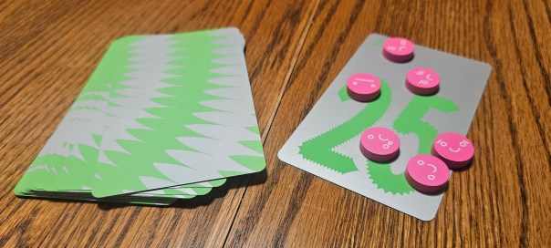

I do like the spiky design of the numbers in No Thanks here. Looks like they’re smooth for small numbers and get more jagged as they climb. That’s fun!
But yeah these games really deserve to be portable and easy to fit on the shelf. I can’t justify buying this production.
Oof, that box size is a buzzkill.
It’s especially funny now that I’ve noticed that the space-fillers inside the box are the only thing they didn’t apply the Magenta art direction to.
The cards are bold and colorful, and so is the box’s outside. But between them, the insert is a big blank white hunk of nothing. It’s as if they’re <i>trying</i> to emphasize the awkward fit.
Is this what results when a comment is dictated? Twenty Twenty Five?
I feel like I’m missing something. The CMYK version of No Thanks! is $25, and comes in a pointlessly large box. The previous and still available edition comes in a pocket sized box and is £10 (so, $10). The reissues seem to be more expensive for no additional refinement and worse usability. I know gaming shouldn’t just be about price point but still. What am I missing?
I would love if CMYK could include travel tuckboxes inside of these big boxes. That way they can have their shelf presence and I can have a game I could take to the bar.
Now that’s a great idea!
Glad I own the Z-Man version of No Thanks, which is, as far as I can tell, the only (English-language) edition of the game that features the name of the designer on the cover. The box size is of course also a concern, but I’m more than happy to be able to enjoy the game while passing on CMYK and their insistence on devaluing design work in favor of “aesthetics” (i.e., branding).
Upon some follow-up searching, looks like there were a few others that also name Thorsten Gimmler on the cover (seems the Mayfair edition did, and some, but not all, Amigo editions). Makes CMYK’s approach all the more frustrating, honestly.
According to Geoff Engelstein, the Tabletop Game Designers Association has announced that CMYK will be including the name of the designer on their boxes in the future. I hope that’s the case!
I’m very happy to hear this!
Awesome news! I (among others) got into an argument with Alex Hague the other day about this insistence of not crediting the designers/artists on the box, and even though I understood where he was coming from, it felt nevertheless quite weird to see a person fighting not to do something so easy and good as if it was not-so-easy and not-as-good. Could you point to where this announcement was made? I’d like to read the context around it.
(Also, is this the default comment system on WordPress these days? It’s nice!)
Here you go! Not much context, I’m afraid. Just the statement from the TGDA. https://bsky.app/profile/ttgda.bsky.social/post/3m3lkodskl226